![telling [fashion] stories™](http://images.squarespace-cdn.com/content/v1/63a9ea2013a1ad2ae87f3e38/a20e9ba5-15d5-4fc5-b1bf-697074940e0e/t%5Bf%5Ds+logo_bright.png?format=1500w)
9 mistakes designers make when taking pictures of their projects
In the dynamic world of design, the importance of presenting interiors irresistibly appealingly cannot be overstated. As a seasoned RIBA chartered architect with nearly two decades of experience in both the UK and Italy, I confess that I, too, fell prey to the oversight of neglecting the best photography for my designs.

Photographs during construction and on completion are often considered optional; they distract the designers from their primary duty of directing the work, snagging defects and dealing with last-minute changes by their clients.
That also jeopardises the opportunity to secure professional photography within the tight timeframe between final retouches and client handover.
Faced with this challenge, designers often contemplate the do-it-yourself approach, armed with nothing but their cameras. While the sentiment is perfectly valid, it leads to many common mistakes that can hinder rather than enhance the visual narrative of a design.
To address this, I present nine critical mistakes designers commonly make when photographing their work, along with practical solutions to elevate the quality of the design's actual representation. Embracing these insights will refine your portfolio and strengthen your ability to attract and engage discerning clients. After all, in the competitive realm of design, the impact of a compelling visual narrative cannot be overstated.
Mistake No.1 - “I take pictures with my smartphone”

Please resist the allure of your smartphone's camera for architecture and interior photography—it's not the smartest choice.
smart | smɑːt |
adjective
(2) informal (of a device) programmed to be capable of some independent action.
Relinquishing control of your phone for critical decisions like contrast, depth of field, or light temperature is a gamble you can't afford to take.
Apps like Focus, VSCO, ProCam, and ProShot may offer more control. Still, no matter the number of megapixels, the intricate quality of a smartphone sensor can never match up to that of a medium-low-range DSLR or mirrorless camera.
Mistake No.2 - “I use my professional camera in ‘P’ mode”

If you believe 'P' in your camera's mode selector stands for 'Professional', prepare to be disappointed. In reality, 'P' refers to the Program mode, where your camera, much like a smartphone, makes decisions independently—leaving you with limited control.
Sure, it's a step up from using your phone, but why settle for less when you have professional tools at your disposal?
Bid farewell to 'P' mode and unlock the full potential of your camera by exploring other modes. I highly recommend venturing into the realm of 'M'—manual mode—for ultimate control. If the prospect seems a bit daunting, dip your toes into 'A'—aperture priority mode—which grants you authority over depth of field while letting the camera handle the rest of the calculations.
Mistake No.3 – “I don’t need a tripod for my camera”
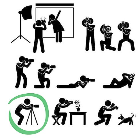
The temptation to forgo tripods is understandable—they're bulky, heavy, and setting them up can be a hassle. Handheld shooting seems faster and grants the flexibility to find the perfect angle effortlessly.
However, we must acknowledge our inherent human trait—we move. Even our best efforts at stillness can't maintain an object in our hands without motion for exposures lasting 1/60 second or longer. In my decade-long experience in interior photography, 90% of my shots demanded exposure times well beyond that threshold.
Resist the urge to crank up ISO (exposure sensitivity) above your camera's native value (usually 100 ISO). While it shortens exposure time, it degrades image quality, resulting in grainy and less defined pictures—an undesirable effect for interior photography.
Invest in a tripod; any non-wobbly option is better than none.
Mistake No.4 – “I shoot in JPEG file format”

No, no, and a resounding no! Unless you're casually capturing holiday selfies or your latest culinary masterpiece for social media, always opt for the RAW file format.
I get it; things start to get a bit technical here. But if you're aiming to elevate the quality of your project's photos and garner positive feedback from potential customers, shooting in a format fully editable in post-production is non-negotiable.
Post-production editing on your computer can range from simple exposure tweaks to adjusting white balance, and even more complex operations. Shooting in JPEG severely limits your editing capabilities. If you find photo post-production daunting or time-consuming, fear not. You can always send the RAW files to a professional photo retoucher who possesses the expertise to enhance them precisely. Elevate your photography by embracing the power of RAW!
Mistake No.5 – “forget about perspective rules!”
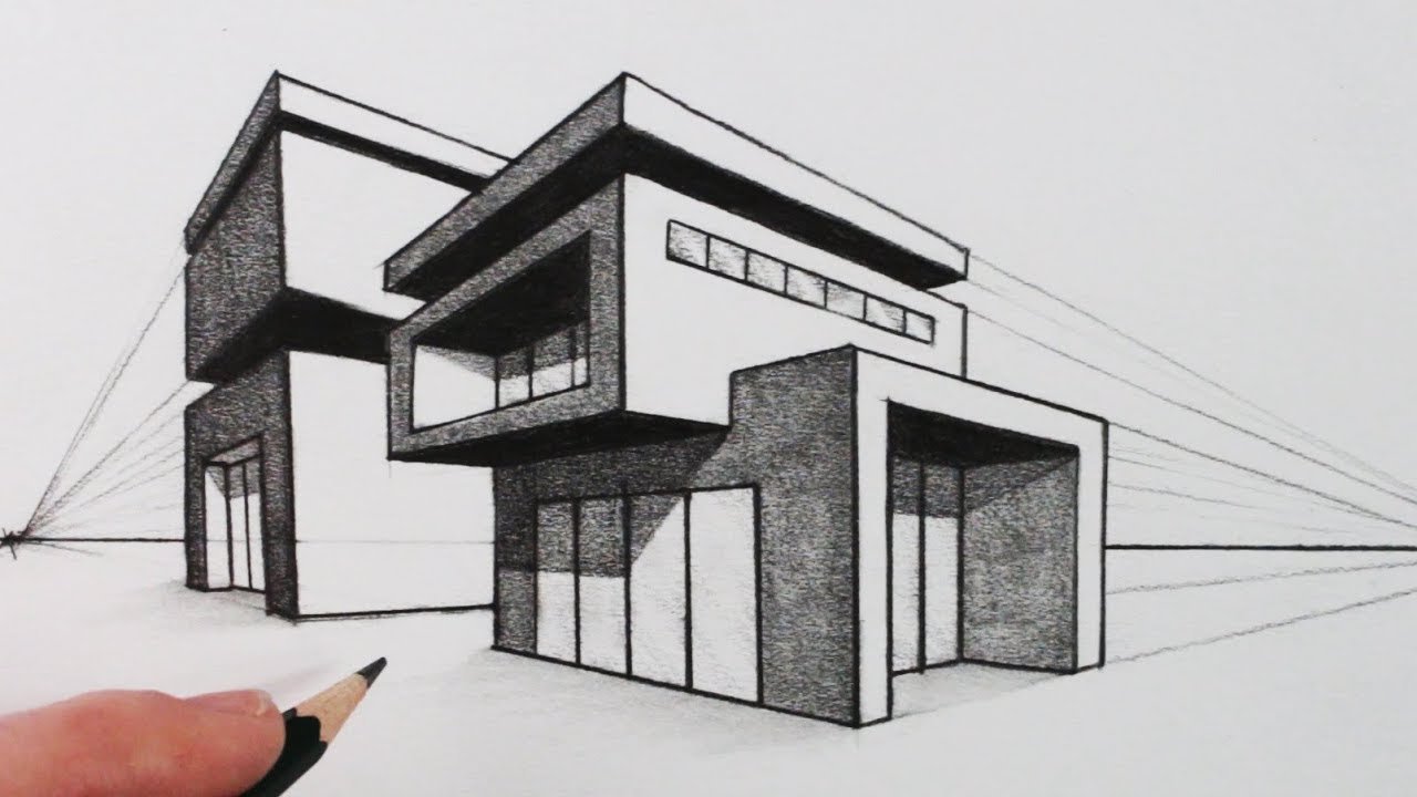
Let me ask a question: When drawing a one-point or two-point perspective, the answer to keeping vertical lines is straightforward—'vertical.' So, why, when taking photos, do we often tilt our cameras randomly, resulting in a bizarre and unpleasant perspective?
Perhaps you're aware of this already, but it's crucial to emphasise the importance of maintaining those lines as naturally vertical. The visual impact improves, showcasing spaces in the most flattering way. This is precisely why placing the camera on a tripod and checking its bubble becomes paramount.
Sure, there are exceptions. However, instances where you aim the camera up, down, or tilt left/right should be deliberate composition choices, not mere annoying imperfections.
Mistake No.6 – “I use an ultra-wide-angle lens, to include as much as possible of the room”

Using an ultra-wide-angle lens might not be a mistake if you're a real estate agent aiming to exaggerate the spaciousness of a property. However, for a designer seeking a pleasant and realistic view, shooting excessively wide is not the best approach. The goal from a designer's perspective is to make the viewers feel as if they are 'inside the room’.
The best practice involves stepping away as far as possible, perhaps near a wall or shooting through a door, and then using a longer focal lens or zooming in to capture the desired elements within the frame. This method helps avoid perspective distortions caused by ultra-wide-angle lenses and prevents vast empty floors dominating the foreground.
Echoing Mies van der Rohe's wisdom, 'God is in the details.' To showcase the fine details, precious materials, and craftsmanship behind your project, get close to the objects you're capturing in the picture. In my experience, I often find the use of lenses around 24-35mm for general views and 85mm for detailing (focal lengths for a full-frame DSLR) strikes the right balance.
Mistake No.7 – “I keep the room lighting off, to avoid glares and burnt spots”
project by Lighting Design Studio, photo animation by Marco Joe Fazio ©all rights reserved
You may have already noticed that the photos of your beautifully designed interiors are unpleasantly burned out in the proximity of lamps, chandeliers and downlights.
Then you wisely decide to switch them off, solving the problem drastically… Don't worry, you are not the only one. I have seen many so-called professional photographers doing that too!
But that's not what you have designed. You have spent time selecting the best lighting, the costly suspended light in Murano glass that your client loves. That very same feature that 'make the room', that beautiful light, is the one you want now to switch off because it doesn't show right in pictures? You must be crazy! LOL
I admit it is not easy when we need to deal with hotspots (very bright areas). Then as a first (cheeky) solution, I would suggest framing the view differently, not including them in the picture. But that's not what we often want.
Then, if possible, another thing to do is to dim those lighting, reducing the hotspot to a lower value. Those will still appear bright and 'live' in the picture, but there won't be giant halos and burned areas as if they were at full blast.
If that doesn't solve the problem (because the lighting is not dimmable or still too bright), then things get a bit more complex. You may need to introduce 'extra ambient lighting' in the room, using additional sources (continuous or flash lighting) without making them too obvious and preserving the room's atmosphere.
Mistake No.8 – “I expose the interiors correctly, then windows and outdoor spaces are consequently way too bright”
design by Mia Karlsson Interior Design, photo by Marco Joe Fazio © all rights reserved
Similar to the previous mistake, this one poses a challenge we can't simply switch off or dim—the sunlight. While showcasing outdoor views through windows or glass partitions is beneficial, the limited 'dynamic range' of camera sensors (varying with cost) struggles when indoor and outdoor lighting starkly differ in quantity and quality.
This intriguing yet complex phenomenon won't be delved into here (but feel free to ask for more info). What's crucial is knowing we can address this issue in several ways:
Adjust interior lighting with extra light and colour gels.
Screen sunlight with translucent fabrics – called silks – if areas are reachable and not too vast.
[Intermediate technique] Take two shots of the same view—exposing once for interiors and once for exteriors—then compose the images in post-production (adjusting white balance accordingly).
[Advanced technique] 'Paint with light' in dark areas on various shots, later composing them in post-production.
There's no one-size-fits-all solution, and each case requires consideration of multiple factors. Often, a combination of two or more of these solutions proves most effective. Experience will be your guide in determining the best approach for each unique situation.
Mistake No.9 – “I show the rooms as aseptic as a chemical lab”
floor by Porcelain Tiles, photo by Marco Joe Fazio © all rights reserved
While presenting immaculate and clutter-free spaces may seem like a design choice, consider this perspective. Your clients envision spaces that evoke a sense of home, workplaces that resonate with human warmth, and leisure centres that promise enjoyable experiences. Agreed?
The photos you capture of your designs should reflect exactly that. It doesn't imply showcasing untidy or chaotic spaces. Instead, aim for a 'planned fortuitous circumstance.' Although it might sound contradictory, this technique effectively infuses life into a picture.
Here's the secret I've learned from collaborating with skilled interior stylists. After determining the view (and securing the camera on a tripod), start by clearing the room of unnecessary objects and meticulously cleaning every surface. High-resolution images reveal astonishing details (and dust!).
Next, strategically position furniture and props to 'look right' for the camera. In two-point perspectives, you might place pillows on a bed off-centre to achieve symmetry, or adjust curtains for a centred appearance in a window.
To break the 'stillness,' introduce seemingly random objects like an open book with reading glasses on a coffee table, a dress casually placed on a bed, or a pair of wellies in the hall. The possibilities are limitless but require a touch of creativity and thoughtful preparation.
Remember, to breathe life into your projects, style, style, and style again in your photos! It's the key to portraying spaces that resonate with the warmth and vibrancy your clients seek.
You might already be familiar with some of these points, indicating that your photography is at a commendable level. Consider evaluating the aspects you haven't explored before to test your skills and enhance your photographic expertise. Alternatively, you may choose to engage a professional photographer to elevate your imagery and showcase your projects in the best possible light.
I apologise if my tone seems a bit assertive; however, I believe in upholding the highest standards when capturing interiors designed and executed with utmost care and professionalism.
In future articles, I will delve into these topics with real examples and case studies, providing insights to help you grasp what constitutes a great picture. Feel free to reach out for additional information in the meantime.
Ad maiora,
Marco Fazio
CCO & Director of Photography, MArch, AOP